
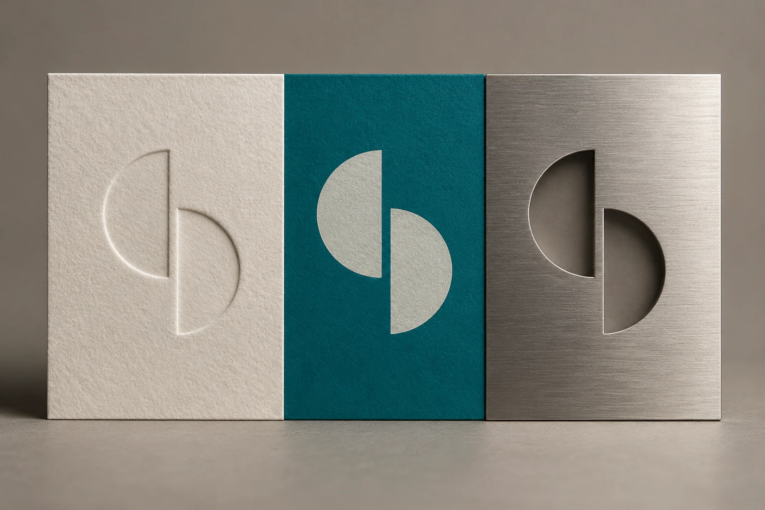
A logo introduces a brand. The rest of the identity helps people recognise it, understand it and remember it. Typography, colour, imagery and layout all shape that experience.
Start with the idea.
Before drawing a mark, define what the brand stands for and what it needs to communicate. Who is it speaking to? What should people understand? Which qualities should remain consistent as the business grows?
Build a language.
A strong identity gives designers a useful set of relationships: how type behaves, how much space a layout needs, what kind of imagery belongs and how colour supports meaning. These decisions connect otherwise different materials.
Make it work in context.
The identity should be tested where people will actually meet it. A presentation, a small mobile screen and a printed brochure ask different things of the same system. A clear identity can adapt while remaining recognisable.
Give consistency room to breathe.
Guidelines should protect the defining features of a brand while allowing enough flexibility for new ideas. The goal is a coherent presence, with the freedom to keep the communication alive.
All Articles ↗